Understanding Colors for a More Effective Vehicle Wrap
Colors are going to be a big factor in the effectiveness of your vehicle wrap. Understanding the psychology behind the various colors, and how colors work together will help you create the most effective vehicle wrap design.
Choosing colors for your logo

Choose colors that match the personality of your business.
The vehicle wrap design should match your brand and your logo. When you design your logo, choosing the right colors can help you set the right mood and tone for your business. Choose colors that will enhance your business, your concept, and your mission. Colors can help you tell a story and help your customers understand your business.
Colors have personality
Every color has a personality. Find the right color combination to match your personality and the corporate culture of your business. However, you want to limit your colors to the main “personalities” that you want to impart to your customers. Too many colors can make your business seem fragmented and lack authority. You want your colors to give off a clear and concise message about you and your business.
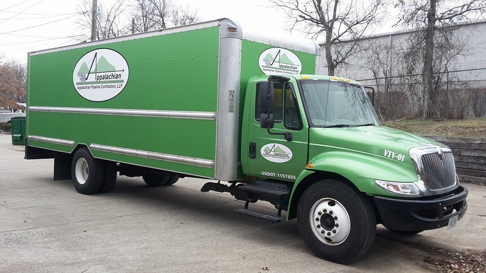
If you want to give off a sense of luxury and sophistication black is the go-to color. If you’re looking to give off a fresh and clean personality, white is a popular choice. If environmentalism is your primary concern, then you want to make green your primary color. For a friendly and fun personality look for the happy yellow, and for passion play with the reds. Many people will choose blue as their favorite color. Using blue will make you appear familiar and trustworthy. Understanding how those colors will look on a matte or shiny finish should also be considered.
The right ratio of colors

Make your primary color at least 60% of your logo for the best effect.
When you use a few different colors there is a common design rule that has been used for ages. It’s the 60-30-10 rule of design.
- Primary color – If you are using three colors, pick your primary personality and find the matching color. The primary color should take up about 60% of your design.
- Secondary color – The secondary color or personality is going to take up about 30% of your design. Look for a complementary or contrasting color for the best effect.
- Accent color – The final 10% should be an accent color. If you already have two complementary colors as your main focus, choose an accent color that is contrasting. A final touch of a contrasting color will make the whole design come alive.
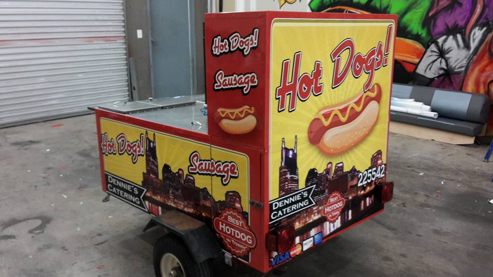
Once you have your design, Twisted Concepts in Nashville can wrap that design on just about anything, including tour buses, vehicles, vans, trucks, trailers, and inanimate objects.


